SwitchTube
YouTube redesign for HCI research project on dark patterns
Paper accepted for ACM (CHI) 2021.
Sep 2019 - Sep 2020
Youtube Redesign for CHI 2021 Research Paper on Dark Design Patterns
Sep 2020 - Dec 2020
Project Detail
SwitchTube is a mobile social app that is a redesign version of YouTube to support and undermine users’ sense of agency by allowing users to switch from “focus” and “explore” modes.
My Role
I was the lead designer, researcher, and the co-author of this project on a quarterly rolling team of 5-8 people.
Major Contributions
User Research
Concept/Ideation
Visual Design System
UI/UX Design
Prototyping
User Testing
Paper Submission
Deliverable
Visual Design System
Clickable Prototype
Tools
Figma
Illustrator
Miro
BACKGROUND
In the attention economy, video apps employ design mechanisms like autoplay that exploit psychological vulnerabilities to maximize watch time. Consequently, many people feel a lack of agency over their app use, which is linked to negative life effects such as loss of sleep. Prior design research has innovated external mechanisms that police multiple apps, such as lockout timers. In this work, we shift the focus to how the internal mechanisms of an app can support user agency, taking the popular YouTube mobile app as a test case.
Identify Dark & Light Patterns on YouTube
An attention capture dark pattern is a UI pattern that is likely to attract or hold a user’s attention in ways that they later regret, if they were made aware of the pattern’s influence.
For the first two weeks, we conducted literature review on dark design patterns and created a gallery of dark patterns and design patterns so that we can distinguish them later.
Identify, Brainstorm & Prototype
For the next one week, we brainstormed 10 different forms to present patterns we discovered for YouTube. We went for quantity & significant diversity and checkout the ways in which patterns have been presented in previous work.
Later, we identified and categorized dark patterns on YouTube and used an Amazon-style memo & Miro board discussion to go over our findings.
USER RESEARCH
We investigate two research questions in two studies that build upon each other:
RQ1: What existing mechanisms in the YouTube mobile app influence sense of agency?
RQ2: What changes to these mechanisms might increase sense of agency?
Study 1: Survey of 120 YouTube Users
We how existing mechanisms in the YouTube mobile app support or undermine sense of agency (RQ1). We decided to start by investigating user’s experiences in the current app before proceeding to design and evaluate potential changes in Study 2 (RQ2).
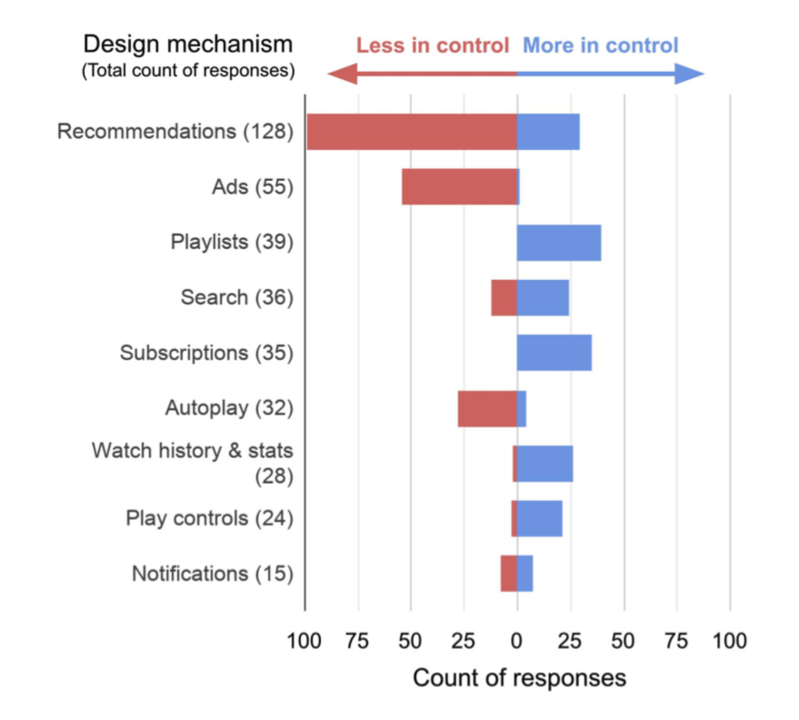
In summary, recommendations were the most frequently mentioned mechanism, accounting for 27% of all responses. Recommendations, ads, and autoplay primarily made respondents feel less in control. Playlists, search, subscriptions, play controls, and watch history & stats primarily made respondents feel more in control. Notifications were divided with about half of responses in each direction.
Study 2: Co-Design with YouTube Users
In Study 2, we sought to understand how changes to these design mechanisms might in- fluence sense of agency (RQ2). We conducted 13 study sessions with individual YouTube users that included two co-design activities:
sketching participant-generated changes; and
evaluating researcher-generated changes that were based on the results of Study 1.
Co-design Activity 1: Sketching
To elicit participant-generated ideas, we asked participants to sketch over paper mockups of three key screens: home, search, and video player. Each screen represented a minimal version of a video app without rec- ommendations, rather than a direct copy of the current YouTube interface.
Co-design Activity 2: Evaluation.
To receive feedback on our changes from YouTube users, we asked participants to evaluate our mockups of the redesigned mechanisms in the YouTube mobile app.
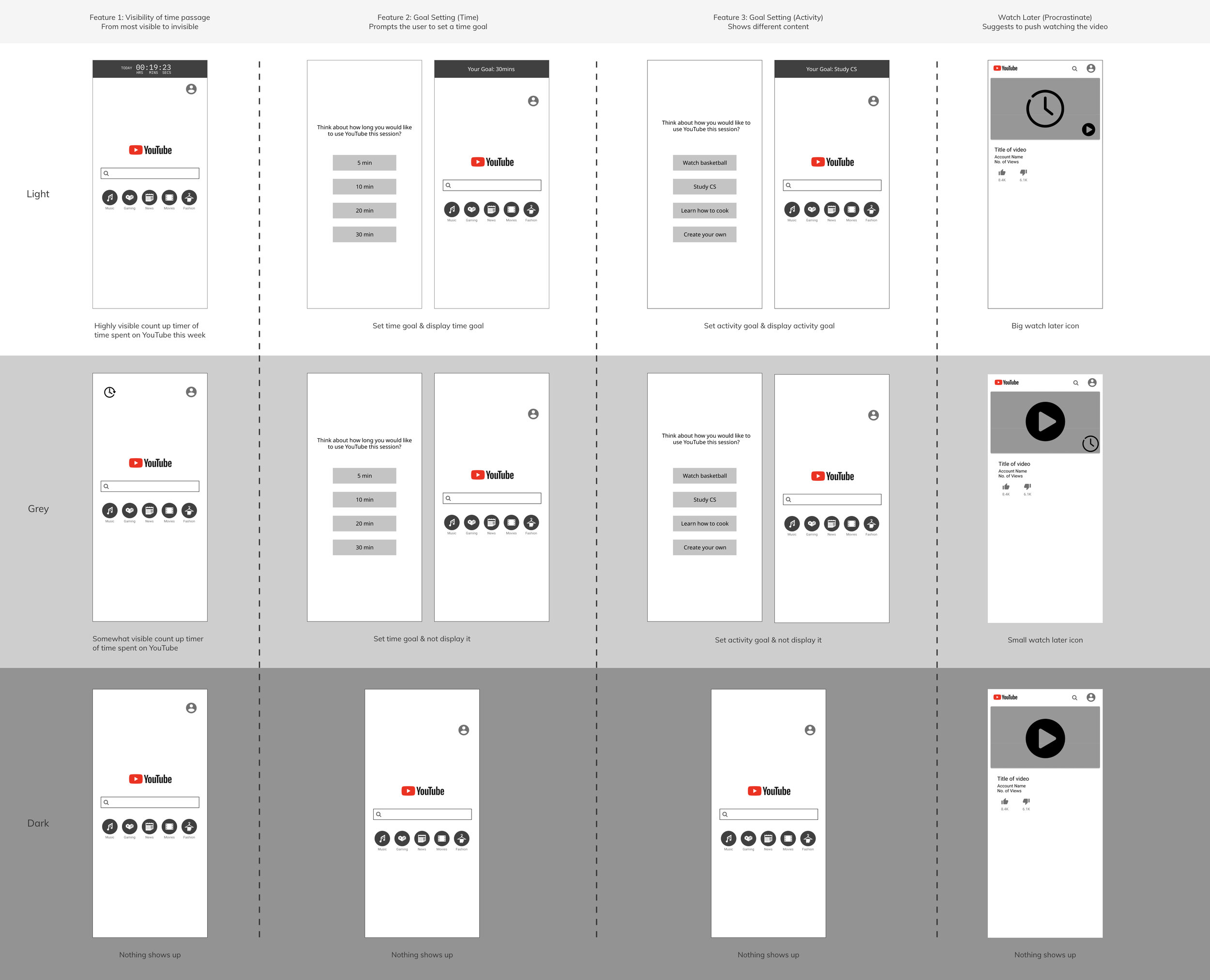
In preparation for the evaluation co-design activity, we created mockups of changes to mechanisms in the YouTube mobile app that we expected to impact sense of agency. To generate a wide range of possible changes, we started with a design brainstorm that generated 67 different ideas, e.g., creating a ‘How-to mode’ for viewing only educational content, reducing video playback speed to 50% after a daily time limit is exceeded, or making Watch Later the default action for recommendations.
Testing & Evaluation
We presented, discussed, and then scored these sketches according to three criteria: expected impact on sense of agency (based on the results of Study 1), novelty relative to existing digital wellbeing tools, and feasibility of implementation.
At the end, we decided to develop the dark and light versions for the final design with 5 shared features. Also, we provided flexibility for users to switch between versions and named the app “SwitchTube”.
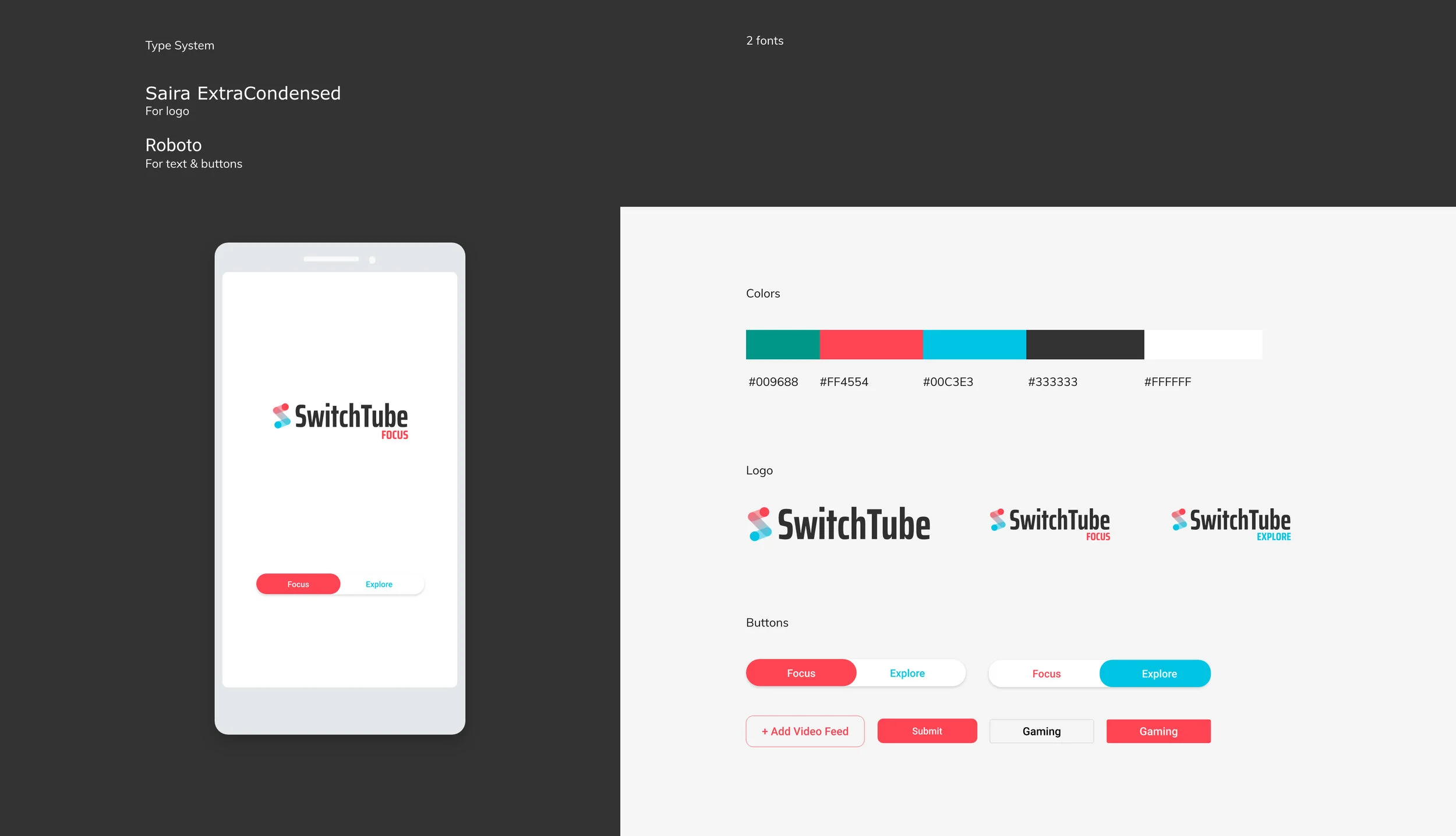
VISUAL DESIGN SYSTEM
Feature 1: Universal User Login
User need to login with a study ID and the app will take the user to the correct version of the app which is by default the “Focus“ version.
Feature 2: Home Page
The Homepage of the SwitchTube has different designs for both modes. For the focus mode, the user need to select video feed based on personal interests, whereas the explore mode shows the video feed page directly.
Feature 3: Search
The search feature is an universal feature that fits two modes. The only difference is that the search results will be different based on user’s previous actions on video feed.
Feature 4: Video Player
The video player for the focus mode only allows user to pause, resume, and reply a video. However, the explore mode will recommend a new video at the end of the current video and show a list of recommended videos below.
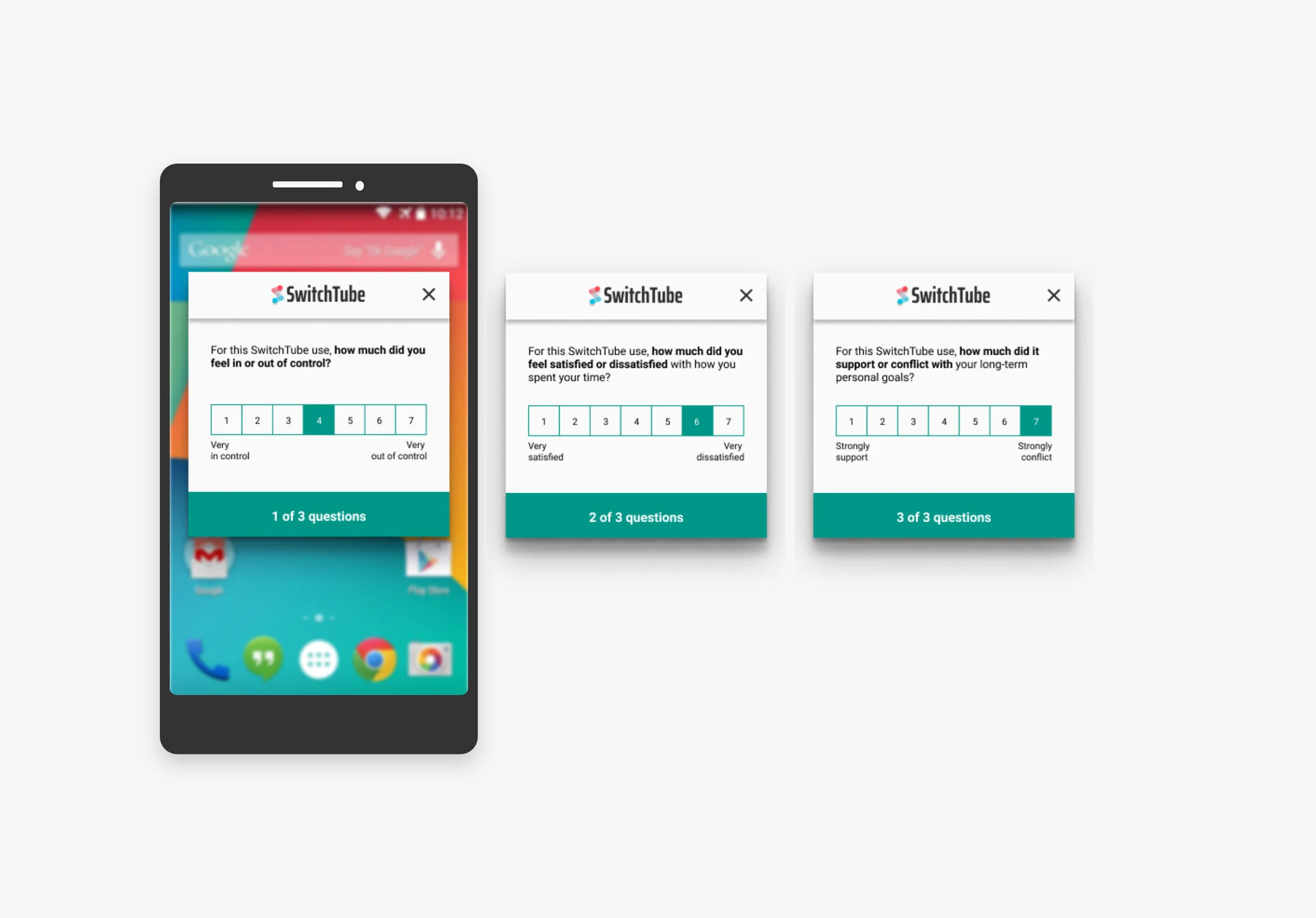
Feature 5: Experience Survey
The 3-question experience survey is designed to understand user sense of agency - feeling of control, satisfaction, and alignment with personal goals using different modes of the app.
As results, we generated two themes about how participants expected changes to the design mechanisms of YouTube would affect their sense of agency.
First, participants wanted design mechanisms that provided more control when they had an intention in mind as opposed to when they just wanted to explore.
Second, participants envisioned and wanted mechanisms for active and informed choices to increase control.
DISCUSSION
Together, our two studies identify design mechanisms that influence sense of agency in the YouTube mobile app and how they might be changed to increase it. In Study 1, participants reported that, in the current app, recommendations, ads, and autoplay mostly led them to feel less in control, whereas playlists, search, subscriptions, play controls, and watch history & stats mostly made them feel more in control. Across all existing mechanisms, participants felt less in control when the app took actions of its own without their consent (e.g., autoplaying a new video recommendation). Recommendations were of special concern and participants expressed frustration at their inability to customize their location, quantity, and content. In contrast, by helping participants plan ahead for even just a short while, existing mechanisms like playlists and watch stats made participants feel more in control.
When participants envisioned and evaluated changes in Study 2, they wanted more opportunities to make active choices, rather than respond to a set of choices proposed by the app. This preference was stronger when they had a specific intention in mind (e.g., to watch a certain video or topic), whereas when their intention was more general (e.g., to pass the time) they favored turning control over to YouTube.
We expect that our findings on how design mechanisms influence sense of agency on YouTube are most likely to generalize to other social media and media apps where users (a) report feeling out of control at times; and use the app for both specific and non-specific intentions. We first discuss our findings mostly with respect to our test case of YouTube, before considering implications for digital wellbeing more broadly.
LEARNING
A year long research+design+develop experience!
I had so much fun in this research group studying dark patterns and designing an app for research purpose from scratch. The whole experience is so rewarding and I have learned and improved a lot in my design and research skills. I have became a better UX generalist for sure!
Micro-Interaction, responsive design, XML coding, you name it!
I have got the chance to touch on various design techniques in the process. I have enjoyed exploring the possibilities to achieve an expected design outcome while considering the resources and technical constrains.
Keep learning and moving forward!
I love this project so much because everyone on the team is learning and solving a piece that is unknown or unexplored. This is the charming part of doing research and I found myself loving the process of learning how to solve a puzzle.
IMPACT
The project paper ““How the Design of YouTube Influences User Sense of Agency” has been accepted by the ACM Conference on Human Factors in Computing Systems (CHI) 2021! 🎉
Researching with ❤️ in Seattle


