The Vera Project
Visual system redesign of the Vera Project website.
Independent Designer at UW MS HCDE Visual Communication Class
Mar 2020 - Jun 2020
Visual System Redesign of The Vera Project Website
2020 Mar - 2020 Jun
Project Detail
This project is a visual design class project. The redesign will identify the current Vera Project website issues and create visually appealing system that conveys the Vera branding. It will provide clear design with good layout and eyepatch. It will also simplify and balance the information calling out actionable items and reducing repetitive information.
My Role
I am an independent designer in this visual system redesign project.
Contributions
Identity/Branding
Visual Design
Web Design
Mobile Design
Deliverable
Visual Design SystemResponsive WebsiteClickable PrototypeBrand Posters
Tools
Figma
Illustrator
Photoshop
BACKGROUND
THE CHALLENGE
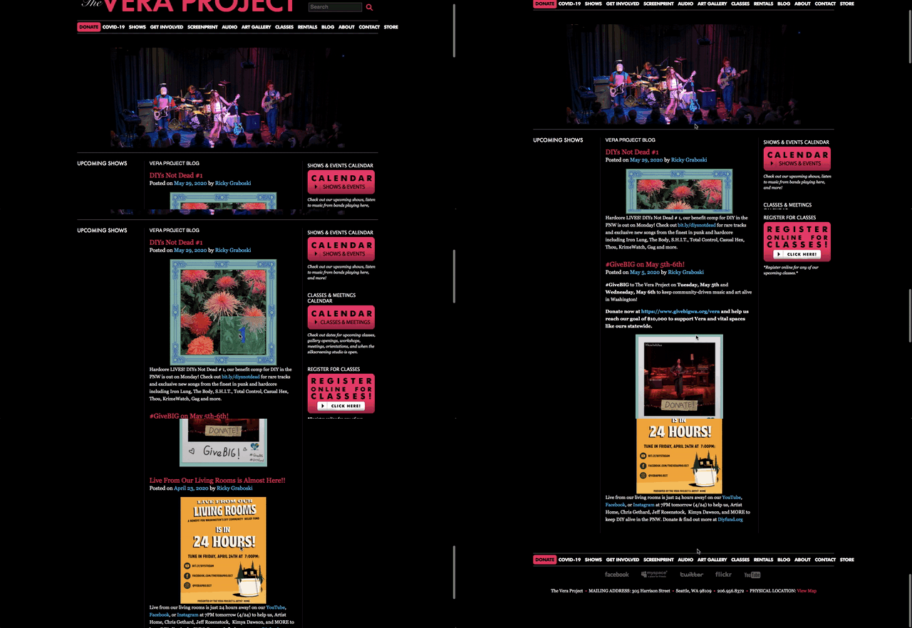
The current Vera Project website does not evoke a sense of participatory or educational theme which is a huge part in its branding.
The target audience for the Vera Project should be youth-driven but is not clearly represented and showcased.
The structure of the website is a little bit chaotic and the information is unbalanced.
THE NEW VISUAL SYSTEM
Mood-board
Primary Logo
The Vera Project logo is an important asset to the organization and should serve as a foundation for all visual communications.
Using a wordmark style that emphasises the “VERA” emblem in a customized font brings out an strong visual impression. Applying a 3D style adds an extra layer of fun in this logo.
Logo Variations
To maintain a strong brand image, it is important that the logo maintain consistency. However, to embrace dynamics, the colors of the logo and its background are interchangebale following the color and style guideline whenever appropriate.
Grid Style
960px window/screen width
iPhone X
16 columns
4 columns
Typography
Colors & Button
Imagery & Pattern
The Vera Project images will always be retro, bold, creative with shades of black and white. Vera photography will focus on the music, art, and show the youth-driven spirit of the organization.
The Vera project patterns, shapes, buttons and icons are used throughout the brand in both digital and print mediums.
APPLYING THE VISUAL SYSTEM
Wireframe
FINAL VISUAL SYSTEM MOCKUPS
Desktop Web Pages
Homepage
Shows
Responsive Design
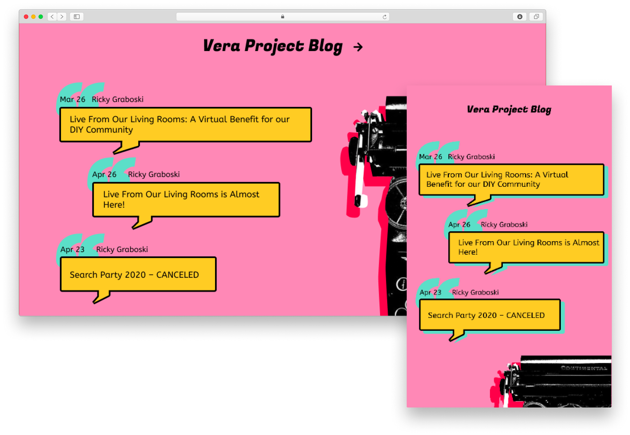
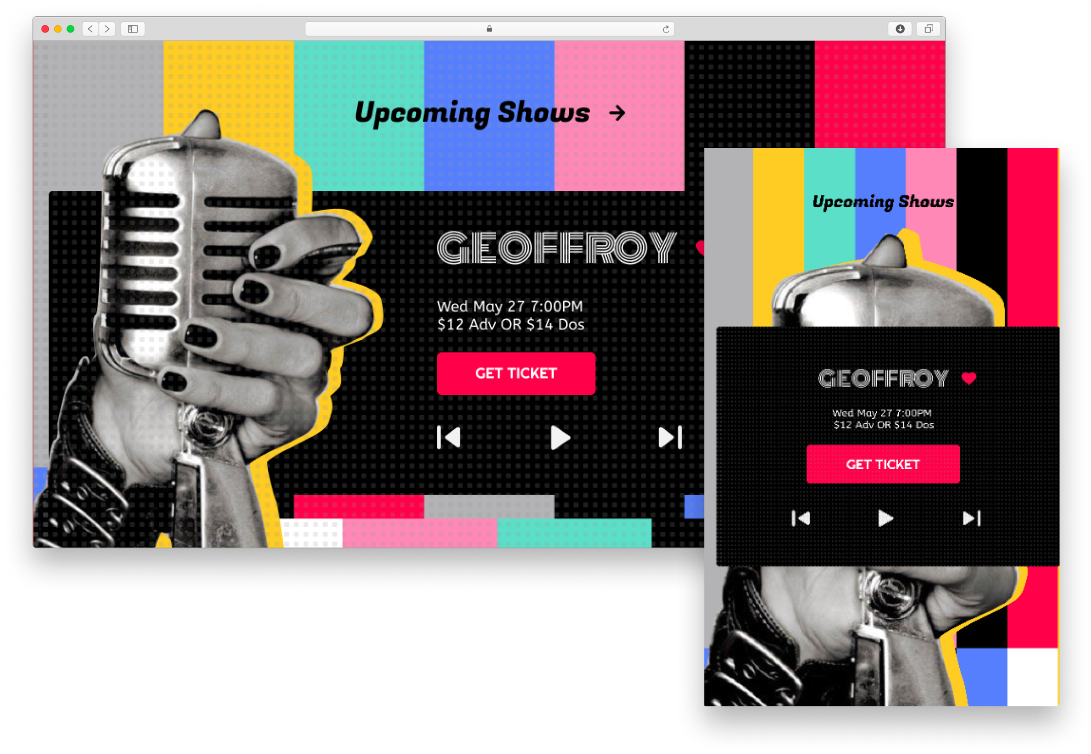
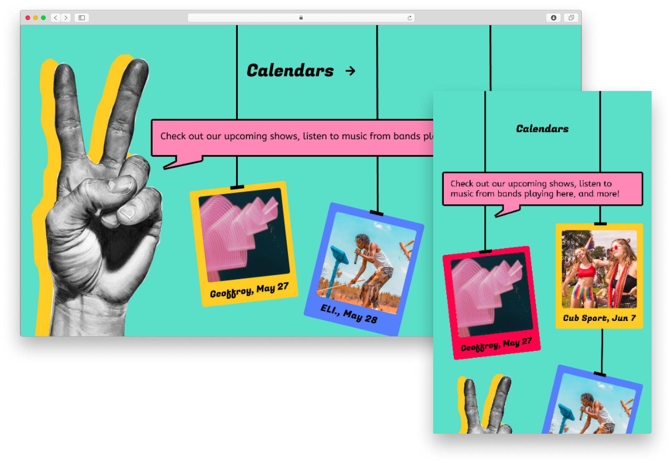
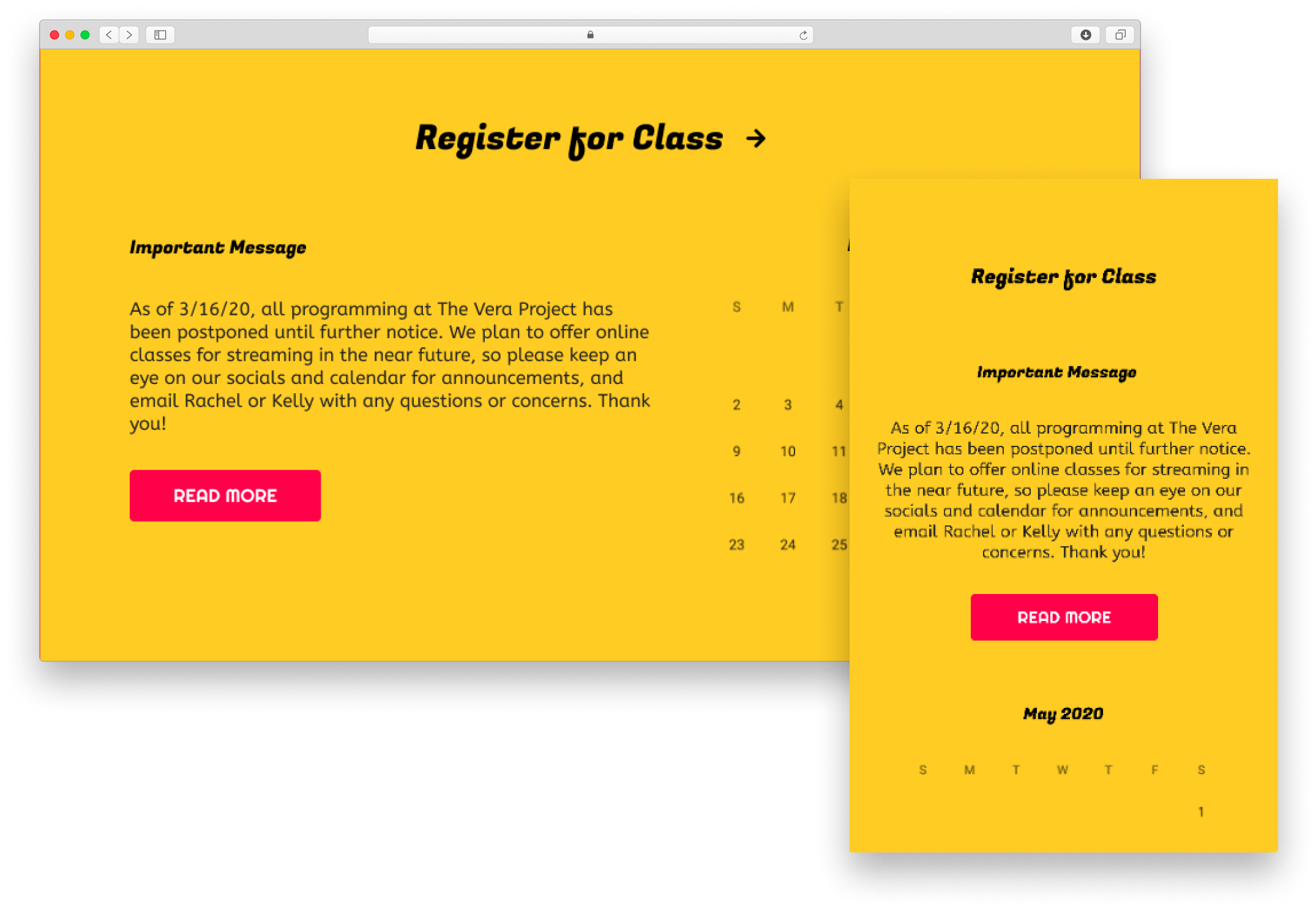
More than the screen fold
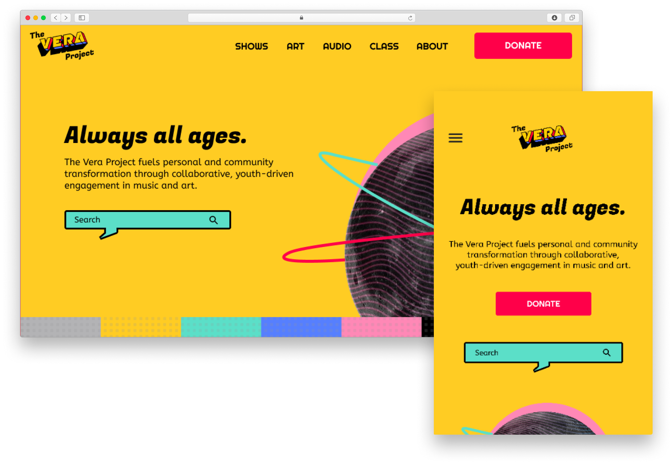
I wanted users to see the most important information on the screen using both Web and mobile devices. For the web version, information were listed horizontally based on the original website hierarchy. When it comes to the mobile version, I made sure the CTA button stays in the center with important informations displayed right up front following by images or putting imagers as the background.
Mobile Web Page
Event Posters
Thinking out of the box! Go wild and explore the possibilities! ✨
Receiving a lot of great feedback from my peers and professor, I learned that it is important to pursue the passionate path and bring it back to the table for discussion.
Keep it straight to the point! 🔥
I have learned that it is important to keep the theme simple with core elements and build upon it to strength the visual. This is effective and really powerful.
Have fun in the process! 🎆
This is the very first visual project I completed all by myself! It helped me build so much confidence in my visual skills and I enjoyed it so much!
Designing with ❤️ in Seattle


